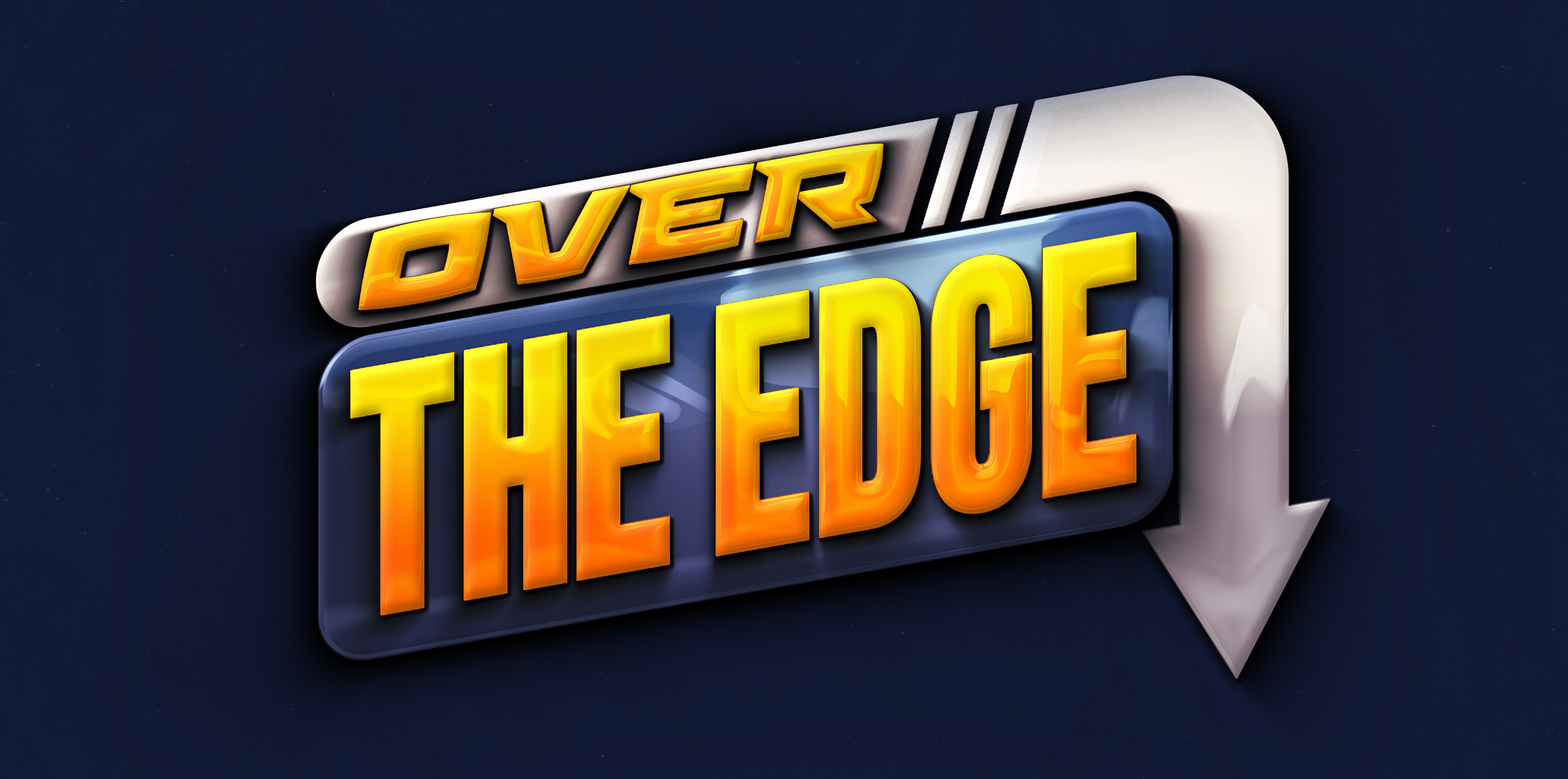
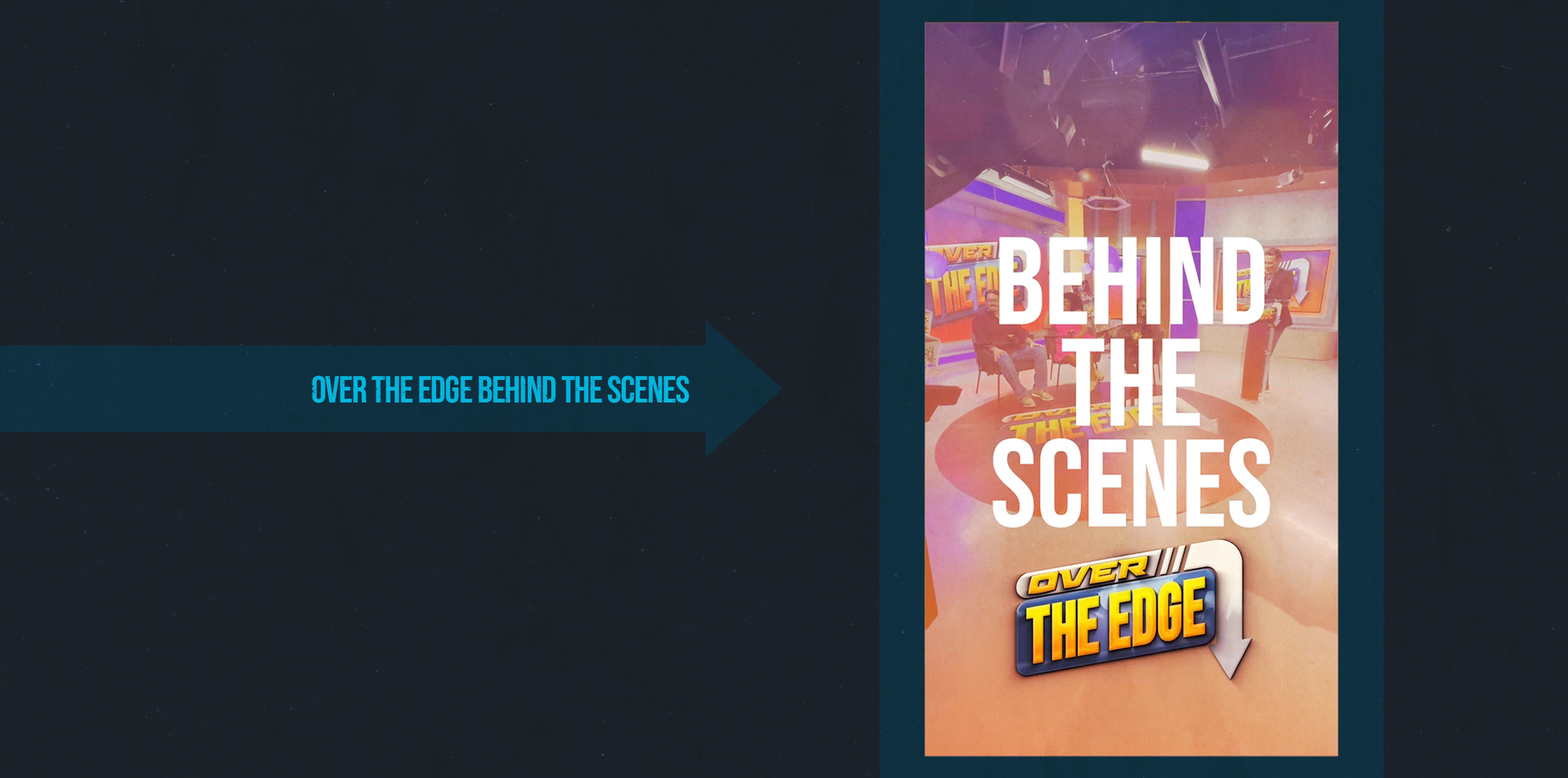
Over the Edge on WCCB
Working on this show with Bahakel Communications was an incredible experience, and I feel fortunate to have been part of it. Even though I worked remotely from the East Coast, it was a unique opportunity that came with its own set of challenges and rewards.
One of the highlights of this project was collaborating closely with the show’s producer and host, who is an exceptionally talented individual. Working alongside them has been both inspiring and enjoyable. They are incredibly collaborative and creative, always open to new ideas and unafraid to explore different approaches. Their positive attitude made every aspect of this project more enjoyable.
Here’s a breakdown of my responsibilities throughout this journey:
- Initial Meeting: My initial meeting with Jeff, our client, involved deep discussions about the show’s vision, mood, desired styles, and the moments we wanted to create. It was my role to be an attentive listener and capture all the essential details. This meeting laid the foundation for understanding the client’s needs and crafting an approved solution.
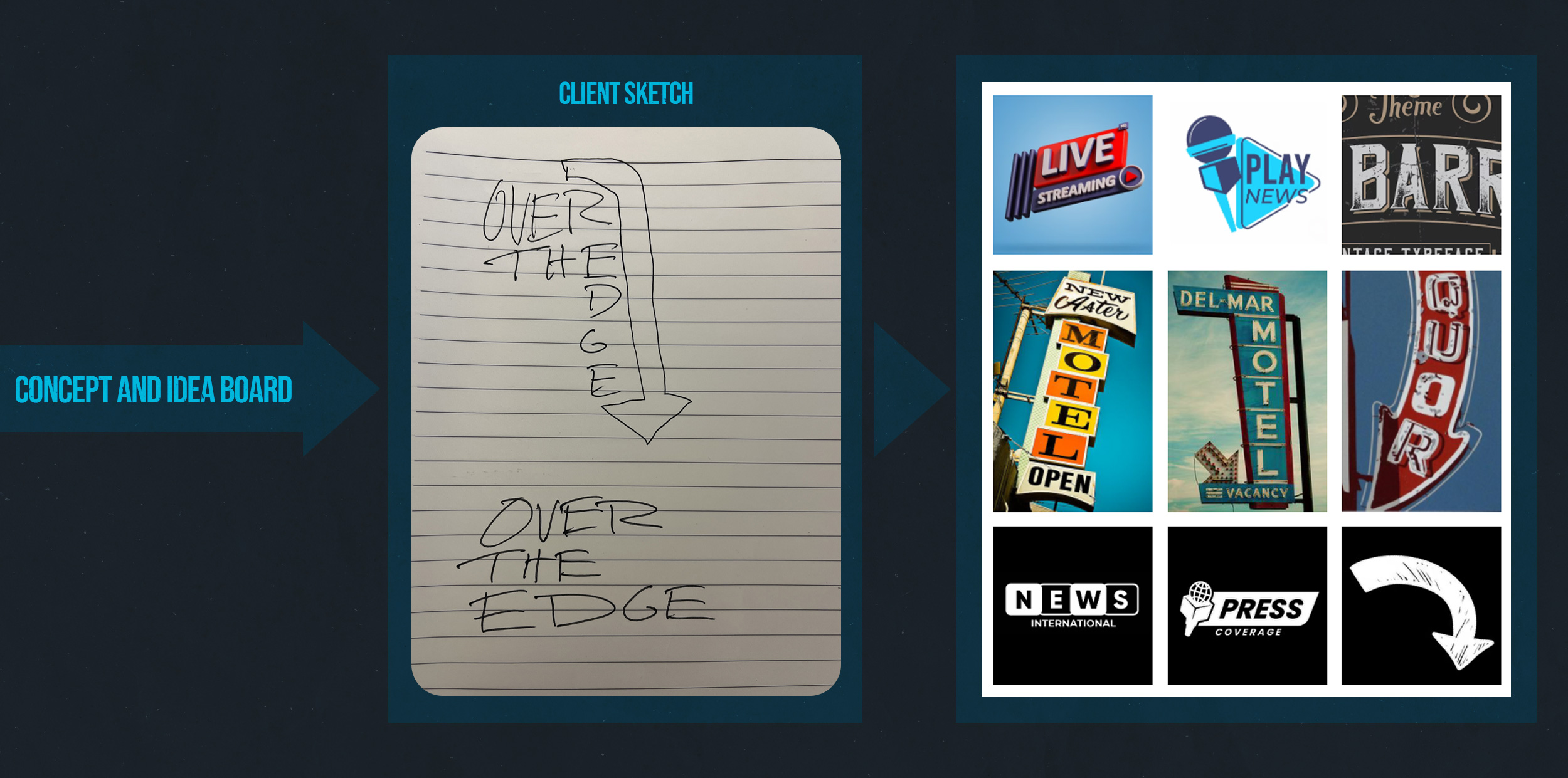
- Concept Development: Following our conversation with Jeff, I embarked on a quest for inspiration based on our discussions. I scoured the internet for visuals that aligned with Jeff’s design requirements. This phase culminated in a mood visual board, a collection of images that partially represented Jeff’s initial ideas. Presenting this board to Jeff sparked another conversation where he could articulate his vision further, thanks to the visuals that aided his expression.
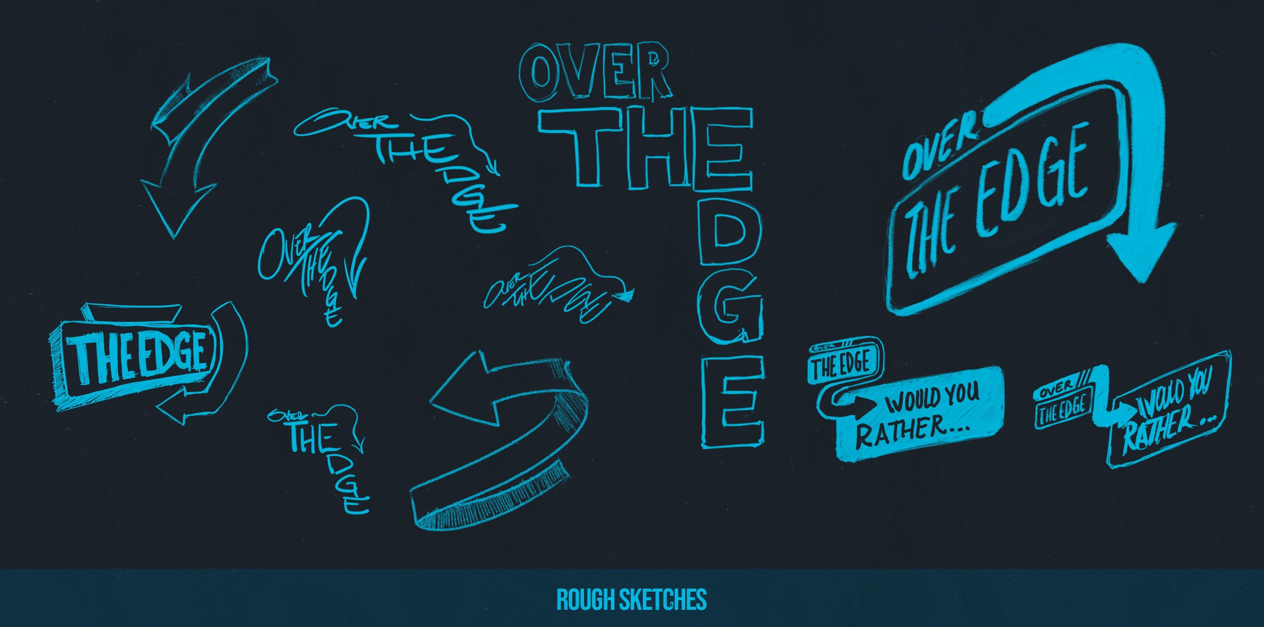
- Rough Sketches: Subsequently, I transitioned to the brainstorming phase, where I sketched out a multitude of ideas that emerged from our conversations. I didn’t filter out any concepts, even the unconventional ones. Through this process, a clear direction began to take shape.
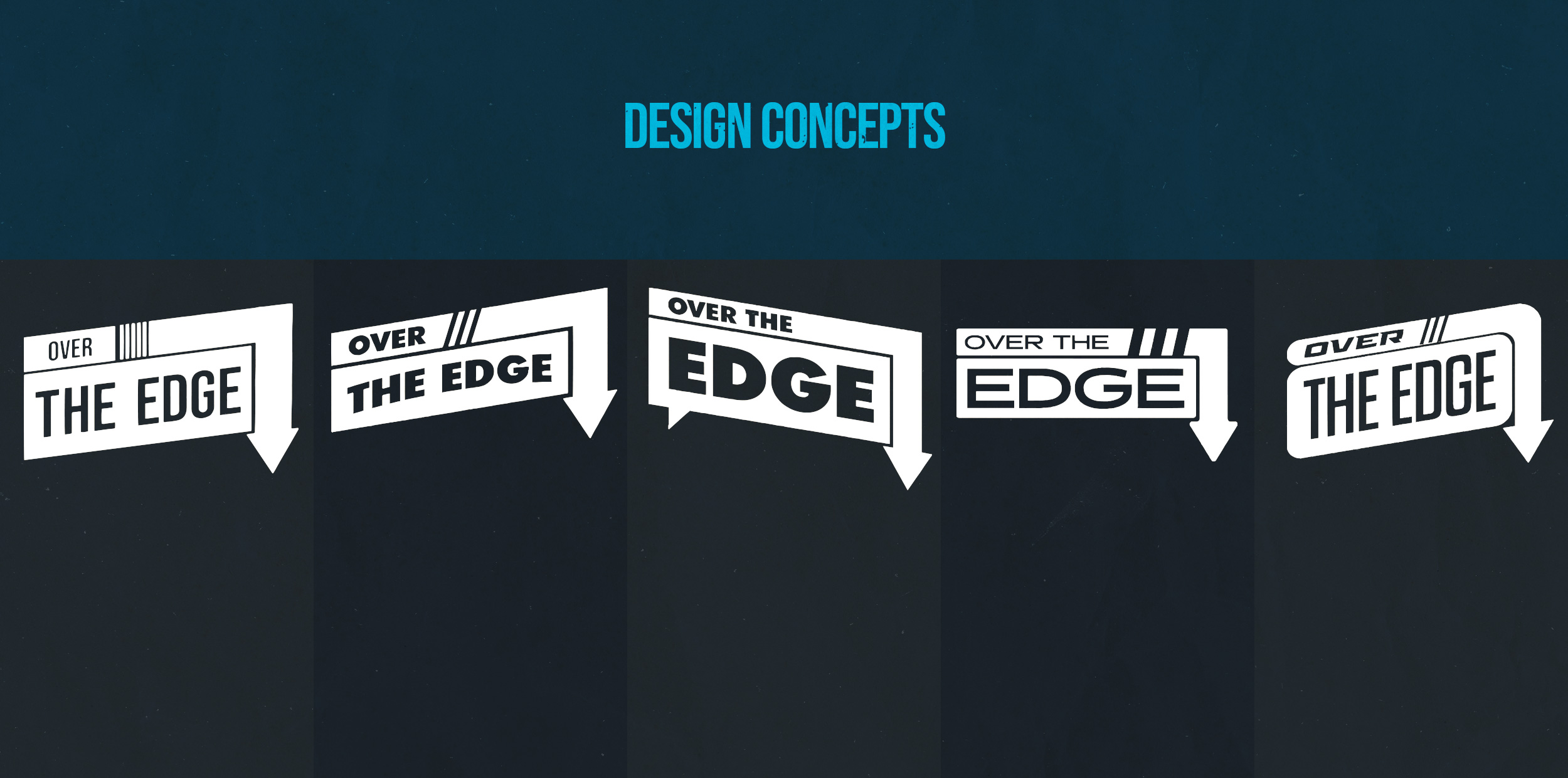
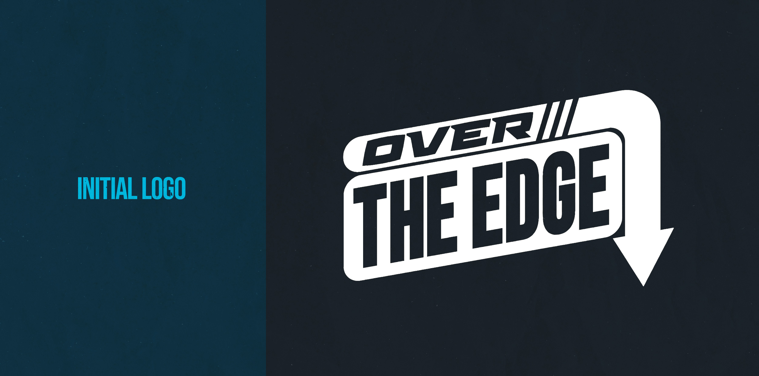
- Design Concepts: Building upon my sketches, I refined a selection of ideas into basic logo designs. These designs featured clean lines and lacked color at this stage. I presented a variety of options to Jeff, who provided feedback and guided us toward a final concept. With his input, we honed the chosen design into its finished form.
- Style and Color: The next step involved applying a distinct style to the flat logo. I transformed the logo’s lines into a 3D format, adding a glossy finish to enhance its visual appeal. Collaborating closely with Jeff, we selected a color scheme that perfectly complemented the design and gave it a polished look.
- Animation: Once we achieved the desired look and feel for the logo, I brought it to life in Adobe After Effects. This phase involved separating various elements and animating them with precision. The goal was to create fluid motions that introduced and revealed the logo on the screen seamlessly.
- Sound Effects: To elevate the impact of each movement, I integrated synchronized sound effects. This addition enhanced engagement by making each animation feel more dynamic and immersive.
- Music: Selecting the right music, jingle, or musical phrasing was crucial to achieving the complete look and feel of the animation. It provided a tone and an overall ambiance that resonated with the entire piece.
In conclusion, this project was a rich learning experience that allowed me to contribute to its success. It was a testament to effective remote collaboration and the power of creative teamwork.
Leave a comment